
Hector Sandoval
Aspiring Data Analyst
ABOUT ME
⬩ ⬩ ⬩ ◆ ⬩ ⬩ ⬩
Aspiring data analyst with a marketing background who enjoys turning data into meaningful insights.
🔹 💎🔹Most dedicated to help teams make smarter decisions by connecting the pieces of a larger picture.
🧩➡️🖼️Ever-growing and passionate about taking new learnings into results.
🌱📈🌳
SKILLS
⬩ ⬩ ⬩ ◆ ⬩ ⬩ ⬩

Excel ⬩ SQL ⬩ Tableau ⬩ Power BI
PROJECTS
⬩ ⬩ ⬩ ◆ ⬩ ⬩ ⬩
EXCEL
SIMPLE LINEAR REGRESSION
A simple linear regression model to predict penguin's body mass based on flipper length.

POWER BI
IRIS DASHBOARD
A Power BI report about iris flowers measurements. It includes a simple table, a scatter chart, and a bar chart. Made fully interactive with slicers.
TABLEAU
IRIS DASHBOARD
The same dashboard as the one above remade using a different engine.

EXCEL ❖ SIMPLE LINEAR REGRESSION
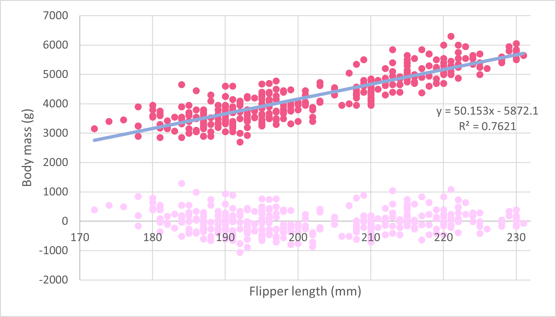
In this project I sought the strongest relationship among various physical measurements of penguins, from the Palmer Penguins Dataset, using Microsoft Excel.To get to the conclusion and make use of it, I:
1.- Explored the dataset with a table highlighting the invalid entries.
2.- Removed invalid entries and reclassified values for further analysis.
3.- Generated boxplots to ensure no outliers were part of calculations.
4.- Created a heathmap to find the strongest relationship.
5.- Modeled a simple linear regression with residual analysis from it.Overall, Excel proved to be a capable tool for statistical analysis, despite some limitations, and the findings demonstrate a meaningful link between penguin flipper length and body mass. 🐧⚖️🪶See the full report ⬩ See the workbook
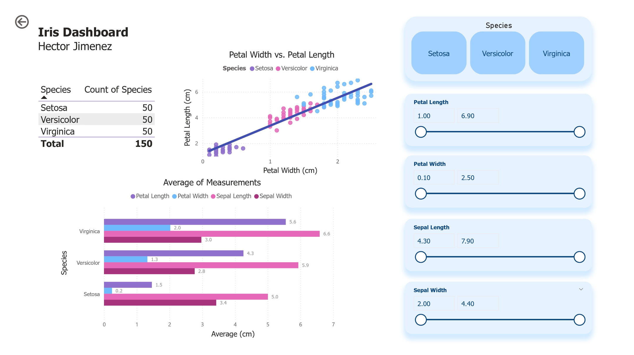
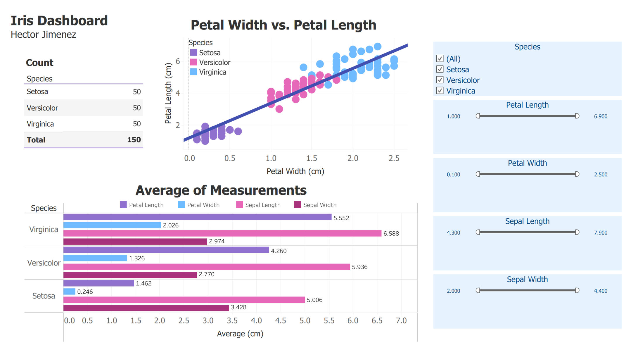
POBWER BI ❖ IRIS DASHBOARD
This Power BI report employs the Fisher's Iris flower dataset to see the different visualizations interact in a dynamic dashboard.During the building process, I:
1.- Imported, verified, and transformed the data for formatting purposes.
2.- Inserted a table to display the species alongside their current count.
3.- Added a scatter plot visualization including a trendline across all species.
4.- Included a bar chart for the average measurements of each species.
5.- Added slicers to make the dashboard fully interactive and user-ready.The end result works as intended and let us easily filter the data to make observations and draw meanings effortlessly. 🪻🌸📏Download a copy
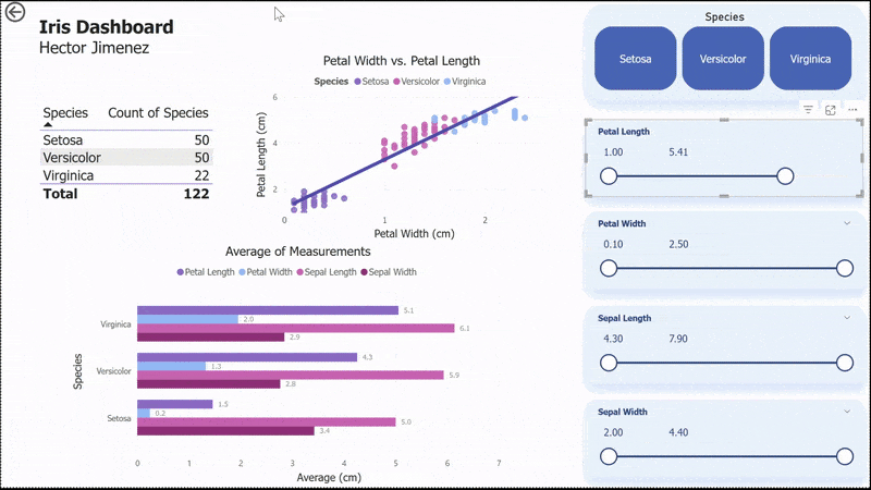
TABLEAU ❖ IRIS DASHBOARD
A Tableau dynamic dashboard to drill down data from the Fisher's Iris flower dataset.To create this Viz, I:
1.- Followed the same structure and guidelines form the Power BI dashboard.Naturally, the outcome is identical. It comes down to the enterprise resources or preferences in BI platforms.
One great perk of Tableau is that it allows to freely share dashboards to anyone, so feel free to interact with this Viz by clicking below. 🪻🌸📊Use the Viz on Tableau